Description
Reviews (23 cached)
Does NOT support 4k
Very stupid. It took me to yahoo instead of google.
i LOVED THIS THEME UNTILL IT CHANGED TO A BUNCH OF FENCES. iM NOT LYING BECAUSE IT Says this theme is still enabled, and sorry for the caps.
First of all when i added to chrome the color on my back ground was blue and that was it, what a lie dont download i
I wish I could go back to the previous theme - this white page is driving me crazy.
Doesn't even show up :(
only blue
It ruined the writing on the tabs.
Doesn't support ultra-wide screens... My screen has a 21:9 ratio and they are blue bars on the left and right of the gradient.
I can't take it off but the calor was nice.
ok so how does it go on my google account
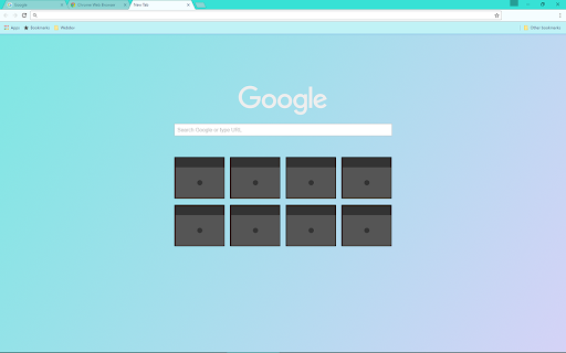
The picture lies and shows a turquoise top bar, but after installing the theme, mine stayed the boring default white.
it would be nice if the tabs are also gradient color
I've been using this theme for a few years. I like the soft colors to it even for the tabs. Recently the color is no longer in the tabs, the tabs are grey now. Overall its been a good theme, just wish the tabs had the soft color to them again as well.
maybe this is just me, but I have had this theme for months, and the colors have always been bright and cheerful. Just recently I looked at the colors and they look greyish, at first I thought my brightness was down, but it was all the way up. It has been a couple days and it still looks the same way. it looks as if the colors literally mixed into each other like paint, it isn't even the same hue. I have tried changing the theme, and going back to this one to see if it works, but it still looks gross. The blue is very dark and greyish and the purple doesn't really look like purple anymore. if you have any idea what I should do, please let me know!
The bookmarks/tabs bar is not blue like it shows in the preview. It just shows up a very dull whitish color.
really bright to the eye but stll really nice
I love the gradient, but it doesn't change the tabs or the bar at the top, so it looks like the default theme when a new tab hasn't been opened. I've made my own custom theme that's the same colours as this, but it affects the tabs at the top too, anyone who wants to use it, feel free: https://www.themebeta.com/chrome/theme/1269212
Ok I like this theme but I wanna switch it to something else and it won't let me remove the extension, how do I remove it?
fine
On the top of the tabs, the names go blurry and pixil-ated apart from the current tab your on.
the top doesn't change to the gradient color (top as in the tabs and its horizontal); would be nice if that changed as well
All I could see was the blue, on my Chromebook. Don't know if it was with anyone else, but I mainly wanted the pink, but only got the blue
Details
| Version | 1.1 |
| Updated | Apr 2, 2025 |
| Size | 1016KiB |
| First Seen | Mar 22, 2026 |
Popular in colors


Popular Extensions