Description
Reviews (19 cached)
Cath Kidston's Theme is much better, and this is just a copy since Cath Kidston is a professional company, they wouldn't copy anything.
this was exactly identical to the cath kidston theme with absolutely no credit to the original. Some one has just taken the cath Kidston theme and dulled it out. not acceptable, hate it!
I wonder why this is so identical with Cath Kidston theme? A copy? why would make a copy and rename it?
I just changed over from my Cath Kidston theme, just to make sure I wasn't seeing things. This is literally IDENTICAL! I'm not impressed.....
wHat the hell, it is just the cath kidston theme copied! exactly copied! go check for yourselves!
This is a ripoff of Cath Kidson's theme.
the only reason it's called vintage is because the picture was edited with instagram ROFL
good
It's beautiful, but I wish the blank had some flowers in it too.
It looks a lot like CATH KIDSTON theme. Did slinky.me steal it and make a copy?
The pink is irritatingly bright. By 'vintage' I assumed the theme would be more muted with faded colors.
not really a huge fan of that shade of green. and that pink is too dark against the black font
normal
YEAH...
The dark green tabs bar looks... not so good when multiple tabs are open.
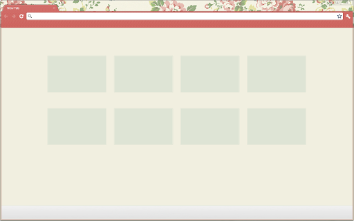
It would be perfect if the floral background was inserted into the new tab background. Currently it's just one solid colour.
Eh, it's ok. Color's too muted for me.
Very nice and simple indeed, but would be perfect if I would be able to read the bookmarks at the top of my page.
Basically the original Cath Kidston theme with the pretty homepage pattern removed and too much green.
Details
| Version | 19.6 |
| Updated | Dec 20, 2012 |
| Size | 382KiB |
| First Seen | Mar 24, 2026 |
More by atilla (ex-slinky)


Popular Extensions