Description
Reviews (14 cached)
good
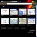
it's cutsey. the ratio on a new tab page is kind of out of wack.
fix color value of google
Please fix the color value of the Google logo on the new tab page so it isn't white but instead colored so it is visible. Also, I don't really like the green gradient used on the navigation bar and bookmark bar.
the green contrast is not enought between tabs and makes not so easy to navigate because of that
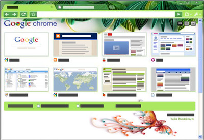
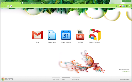
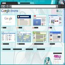
I love the art, but there is a size problem. In my browser the parrot is right in the middle overlapped by other icons or thumbnails. Any idea how to fix that?
cool and fresh
nice one
I would use this theme often, but for the bird. The bird design and colors are actually wonderful, but no matter the size of my screen the bird is always hidden by the apps or the new tab page recently used tabs. This makes the bird look like a messy mistake which makes the apps harder to see.
yeah
I like it. but that's too ordinary :)
Love the background picture, color for selected tab was too green
so nice
Aesthetically this theme is first class, but it has two technical problems. 1. a part of the background on the right (a like a pale green bubble) looks like an extra tab. I found this confusing. 2. The contrast between the tabs and the background is so great it often creates the illusion that the top part of the Chrome window is the desktop, not part of Chrome. I then can't find the X to shut it down. I am futilely looking for it near the wrench.
Details
| Version | 2 |
| Updated | Oct 11, 2011 |
| Size | 4.56MiB |
| First Seen | Mar 21, 2026 |
More by extensions@chromium.org

Popular Extensions