Description

Reviews (21 cached)
Don't like that you have moved the search bar off the main screen at all.
why it's so BIG???? it's a beautifull theme but it soooo BIG!!!
it shows that the symbol will be in the center of your screen but when you add it, it zooms and gets put off to the side of your screen
DIDNT WORK
crap
the off tabs are to dark, cant read them
too dark for my computer
resolution too big
the touch of pink colour of opened tabs is quite odd for me.
too big for my screen
its alright just seems kinnda blurry idk
Tooooooop.... centralizado perfect
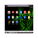
For some reason, two-thirds of the biohazard sign is located on the far right of my monitor... ;-;
Hey.. It's not fitting the window completely..only part of the theme was displaying.
Too many glitches still unresolved.
it's good but there are some themes very good, too!
Cool idea, the execution wasn't great. I love the idea since I'm a biology student majoring infectious disease, however, when the browser is framed and not full-screened the bio-hazard symbol is hidden and that is annoying. -.-
It looks great and its pretty simplistic, but the purple tabs don't really match the overall look of the theme and the image doesn't fit the window.
Colors are acceptable but neither exciting nor very imaginative. Overall impression is pleasant but forgettable.
GO CHEESE
cant figure out how to get it to show the theme on homepage/new window, all it is effecting is my tabs and the search bar #googlechrome
Details
| Version | 3 |
| Updated | Feb 20, 2013 |
| Size | 1.35MiB |
| First Seen | Mar 21, 2026 |
Popular Extensions