Description


Reviews (27 cached)
how do you remove this from a chromebook?
i cant get rid of it help it wont let me delete it ho do i delete it
The current tab color is too dark and cannot read it's font. I love everything else about this theme but this one problem makes is unusable for me.
how do you delete it?
Can't see the text of current tab.
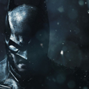
+ Nice Image - Bookmarks bar has a wierd color, and the bookmarks are impossible to read due to the color of the text - Black text (for example the title of tab u are on) is very hard to read
Because of the dark blue theme on top i can't read the tab names at all. Look at it.
can't see the tap font because the text is a dark color.
what was color is that ? i can't read text :| fix it or remove it
It is fuzzy and it didn't fit my screen, the format is so off! I really liked it too. :(
Can't read the tabs and the home screen image is half cut off. Unusable.
exemple when you download the picture your cant see the text what you have downloaded... please change the font color. the bookmark font color should also light up little bit.
another theme with the problem of unvisible writing in the tabs, it is soooo annoying not able to read the tabs, plus the other tab that u are not on, are too bright unsuitable for the whole theme
You can't read the bookmarks.
Can't read the name of the selected tab or the text on the favourites bar.
Can't read text on active tab. Font color is dark and background color is dark.
All the options I have tried have those annoying boxes in the way and I can't get rid of them. Why even have the picture if you can't see it? If I want the boxes I'll pull them up. otherwise, they're just an annoyance. Also, the black cat is not centered--the eyes are not on tne screen.
Nice picture, but I can't read the title of the selected tab because the selected tab background is dark and so is its text.
same thing as Friedrich Schellert
Some of the text elements need to be fixed, ie. black text on the active tab, white text does not show up on the downloads bar, other than this, I loved it! Reminded me of 'Houses of the Holy' from Led Zeppelin :)))))
Quite a nice theme, but it makes some things quite difficult to read and see. (some extensions, some writing in the tabs, etc.)
Doesn't fill the full screen in 1920x1080
The scene is beautiful, but at the top (tab bar), its very dark and hard to read.
the bookmarks bar does not have goo color combination and you miss all the text
Change the color of fonts for active tab because I can't see black on dark blue
The picture itself is beautiful, but I wish the bookmark bar was easier to read.
looks nice, but it's nearly impossible to see the active tab title and bookmark names in bookmark bar
Details
| Version | 1.1 |
| Updated | Jan 7, 2016 |
| Size | 9.08MiB |
| First Seen | Mar 26, 2026 |
More by eltorga


Popular Extensions