Reviews (50 cached)
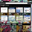
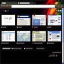
This was my goto theme for years, until a recent Chrome update made it such that the active/selected tab is impossible to discern from the other not-selected tabs. It's frustrating that such a popular Chrome Theme which is owned by Google itself isn't updated to just darken the active tab a bit when it's selected. It must be such a mundane change. Please upvote this review to flag this issue to Google's attention!
Another perfectly working thing ruined, go devs!
The 2023 Chrome Refresh completely breaks this theme. It's impossible to tell which tab is highlighted. Google has disabled the ability to disable this 'refresh', so this theme is basically garbage now.
Somehow Google has managed to break it yet again, the 'Cody' (Customize Chrome Side Panel flag fix) is no longer working because it is no longer a flag. Just disabling the (Chrome Refresh 2023) flag doesn't work. Disabling all the other 'Customize Chrome' related flags doesn't work either... on Chrome v125.0.6422.61
Love this theme since I started using Chrome. Today, Mar 20, 2024, it seems to be back to NOT being able to see the tabs separate even with the special 2023 workaround flag from December reviews. Anyone know a new trick to keep it from looking like one ugly washed out brush across the top?
There is a problem on macos sonama, we can not understand which tab is active !
The reason I'm here is like others, the recent update making it impossible to distinguish tab barriers. Quite frustrating. Oh, well. Let's see what else is out there.
Latest update to "brushed" just isn't making it. If we're going to have tabs, have tabs, not this flat look designed for mobiles. And the animation is distracting. Ditching it after almost a decade as soon as I find something suitable.
Used to be my favorite, now the tabs are impossible to differentiate. Google dropped the ball on this new UI rollout.
This used to be AWESOME.. until recently. Now buttons are difficult to see, the the whole thing is just difficult to use.
Used to be great until they turned all the navigation buttons and bookmark icons in my toolbar white. Now, they are jarring and difficult to see.
Used to be good, but update Aug '16 SUCKS bad. Can't see buttons
its dumb
boo
Looks so messed up
Chrome keeps wrecking this theme with updates. I've been using it for 10yrs, and love the way it looks.
nice
I actually love this theme, but it seems like every time I close and reopen my browser, Chrome resets to the default theme. Then I have to uninstall and reinstall this theme to get it back. Getting really old really fast.
I have used this theme for a long number of years. Not sure why, but now the active tab is impossible to discern from others, so I had to change it for something clear.
Used to be a great theme until the recent Chrome update made it unusable (no visual separator between tabs, focused tab is not highlighted).
I've used this theme for as long as it has existed, but I agree with others that not being able to see the tabs is a deal breaker
I have loved this theme for years.... but I agree with what others have said about the tabs on the latest updates... I can no longer see which one I'm on. Unfortunately I have to move away from this theme because of this.
ugly
Look is nice, but when you have many tabs open, it's nearly impossible to tell at a glance which one is active. You need to change this theme to make the current/active tab an inverse color scheme, white, or black so that it stands out.
fu all
Impossible to use! tabs and favorites are hardly visible!
ALTHOUGH IT'S VERY SLEEK, AND NORMALLY I WOULD LOVE IT. I'D PREFER TO CREATE MY OWN THAT'S HALF THE FUN!
The only thing I didn't like was that the theme looked a little to vibrant on some web pages. Otherwise, good.
This has been my design for ages. But with recent updates it became useless. It's just impossible to see which tab is the active tab.
in new version of chrome, it seems hard to tell which tab is active...
I've used this theme since the first day I installed chrome, but like other recent comments a recent update has made it pretty unusable, its impossible to tell what tab is the current tab when the window is focused. Interestingly if you don't have the window focused you can tell what tab is selected.
It was a great look but since the last update I think (nov 2023) there's no visual difference between the tab you're in and the others one you have. Please fix this.
I am using this theme since more than 5 years. But address bar has turned dark. Can this be fixed?
Used this theme for years but it's now turned the address bar grey, can this be fixed please?
wonderful looking theme, inline with ios general greyish lool , however it is difficult to see which tabs has audio on because the speaker icon is very light
The theme itself was great, but the white buttons blend in so easily.
Used to be great. Not anymore, because the chrome has changed, but the theme hasn't changed with it. Now the letters are unreadable and the loaders are invisible.
very slick
IT is shiny, but not very technological
nice one
on the big screen the pic in this theme is only in the top of the window. bottom is just a grey color
yer its nice but alot of the time the top and bottom of the web page does'ant load and stays black ! p.s "i have a very good pc"
nice
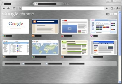
I consider this to be the nicest looking Metal Theme but I would like to see some changes to the App Launcher and New Tab layouts.
very nice one
Hard to read Bookmarks in Bookmark Bar
Doesn't go all the way down the page/screen otherwise would be nice
Awsome, very slick executive design.
Beautiful. But, why is there is a line of blank on the top of the screen? windows 7, 32bit, ultimate. As far as I know, only the default theme does't have the problem.
It's very nice.I like it.
Details
| Version | 1.0 |
| Updated | Oct 10, 2011 |
| Size | 1.09MiB |
| First Seen | Mar 29, 2026 |
More by extensions@chromium.org


Popular Extensions