Description


Reviews (23 cached)
KInda poopy
Doesn't even fit my resolution lol
the ratio to my laptop screen is off. dont get it because its also all stretched out and dosent look good
Doesn't stretch across page
This is a pretty picture but they forgot to color 2 leaves black or gray or whatever color it is. :(
good
Stu[pid, too big
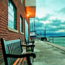
The tabs are hard to read and the bright red for downloading and such made it hard to read as well. I just find this particular theme to be difficult to use. However, the picture is beautiful.
pretty but too much texture,also not working on bigger resolutions
Unfortunately, on the new tab page, the red leaf image does not fully extend to all four corners of the browser window, leaving a very large white border. I have a large monitor (24 inch), so it may just be that the image size is not adequate. Additionally, the red bookmarks bar is hard on the eyes.
Doesn't fit larger screen resolutions.
Pretty picture. Makes app icons text red unreadable really poor choice.
piczure won'T tile well on large screens
FYI doesn't have a fresh look
Beautiful photo, but it doesn't work well on a 1080p monitor.
i love the picture of the fox in snow sue
It sets all the tabs to clear to show theme behind them so unfortunately I can't read what they all are very easily. Otherwise, this is a beautiful theme.
I don't like it because of the amount of bright red, but if it's red you're looking for it's beautiful.
I like the picture and how I can read my toolbar. I just find it a little plain.
Tags hard to read, buttons colors are not so good to the eye
I agree with Chris, It's a little hard to see the inactive tabs. It's also hard to see the banner on the top of the webpage. Otherwise, it's beautiful!
too busy around the transparent tabs, makes it hard to see and read what is on the tabs. Also background picture does not fit, idk if it's because I use a hd tv for a monitor or what but the image background does not cover the whole area
Really cool but too low a resolution for high res displays
Details
| Version | 1.2 |
| Updated | Apr 1, 2015 |
| Size | 3.51MiB |
| First Seen | Mar 29, 2026 |
More by David


Popular Extensions