Description

Reviews (44 cached)
bruh why isn't it letting me uninstall the extension, like i can remove and uninstall any extension i wish, but that option isn't available for this extension specifically, why?
Ugly mofo needs an update -= too many white dots
Not good
i hate
i really dont like it it doesnt show the app when i go to my apps now i can see anythiing!!! awful
plz plz how i can delete it plz remove this goddamn theme and give me my google chrome ihate it
Doesn't fill
I dont like how spotty this skin made the search bar area look.
i cant delete it
The background looks super cool but be aware! You can't see your reload and back button which are essential in a browser, due to the painful red font. I am urging you not to get this if you value your eyesight and not having to squint whenever you need to reload a tab
Installed and do not see the earth view, instead is a view of a black earth in lower portion with atmosphere glow and starfield above. Pretty boring. Also the bookmark names are invisible, no matter what setting I choose. Pretty worthless.
I like the theme but i cant get rid of it, its good, i love it, but i cant remove it.
Website Names on each Tab is not really readable
The Earth is so close up.
Starry background on the BookMarks Bar pains the eye.
Screenshot shows maximize, minimize and close buttons; not anywhere near as visible when I installed this theme.
Bookmark bar and tabs illegible :/
Can barely see text on open tabs.
look great but problem is where e my theme alike does not show half theme only =(
it would be great but the whole image does not show only half.
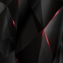
a do not like the red things it looks like it was error
Too many stars on the top makes things hard to read. I don't think it was a good choice to have the buttons red. The New Tab picture is nice, and unlike most of these Space themes, I can actually see what tab I'm in
I like the theme, however it obscures things in the location bar too much. Things like the refresh button, back button, and customize button just disappear. They need more contrast to make this functional as well as attractive.
It was okay I used it for a month.
Good, but does not fill whole screen. The default background for when I open a new tab does not fill 1920 x 1200 resolution.
Wallpaper could have better quality. Too blurry to watch
Nice theme but the tabs in the tab bar are very difficult to discern.
stars make active tab a little hard to read
Font colors are not good enough.
There is a large white bar at the top of my screen where the bottom of the Bookmarks bar touches the actual browser window.
okay but i don't like the little boxes of previous sites. i wanted just the search bar.
the Font is now black and i cant read it
I really love this theme but there's a white gap at the top of my page so it's not fitted correctly for me
Too much stars in the tabs area. Personally I like that area consistent or clean, not spattered with white dots.
Tabs still hard to read...Back, Refresh, and home buttons need to be a different color, not red on a bluish background.
The buttons are almost invisible when not available, this is unnerving as I basically see empty space (pun! lol) when my mind is telling me there should be something there. However, the overall idea and contract is nice, if only buttons weren't "missing", that would be great.
Meh..
MAKE THE HOME AND BACK A LIGHT BLUE SO I CAN SEE IT PLEASE
the stars on the menu favorites bar are too much for my taste. Great otherwise.
Very beautiful theme, however, it obscures the icons on the browser header
looks very big after installaled
The look of the overall theme is great. If you are using an HD screen it is even better. My only comment is that the space around the search bar is also "stary" It makes it hard to read bookmarks and to see extensions.
Pretty nice but the dark red menu bar icons are very difficult to see, and the disabled icons basically disappear.
I love the picture! However, the tabs are kind of hard to see.
Details
| Version | 3 |
| Updated | Apr 5, 2015 |
| Size | 5.26MiB |
| First Seen | Mar 31, 2026 |
More by AndiDote


Popular Extensions