Description

Reviews (15 cached)
rubbish
doesn't look like classic chrome imo
Hey! Google. 'Bright' is not exemplified by monochromatic greys . . . .
I agree with the two reviews from back in Feb 2013 & Sept 2012. "Grey text on grey background....It's difficult to read!" Change it or not I wont be reloading this theme, its not very appealing at all, especially when there are so many more to choose from.
It is hard to read the grey text.
so so
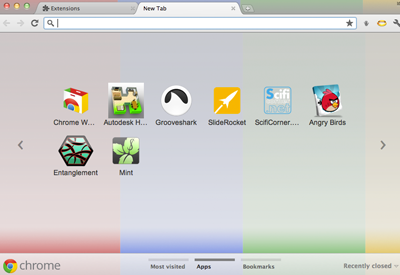
THe background colors are so faded they are easy to miss... But the tabs are easy to read, and that's one of my biggest pet peeves is an otherwise beautiful theme that I can't read the tabs.
boring
its just nice..
I like it, but when I go to the new tab page, it's all greyed out. which I don't like.
I like it, easy to read, not hard on my eyes to see?
Grey text on grey background, and the little arrows that switch between the apps on the new tab page don't show up. Otherwise it's a nice design.
If you fix the home screen text being invisible, its a 5 star.
Change the screen icon font color... It's difficult to read. I'll change my rating to a 5 after. :D
Home screen icons have Grey text on a mostly grey background. You really have to change that. Otherwise a sold 4 or 5
Details
| Version | 1.0.0 |
| Updated | Sep 15, 2011 |
| Size | 508KiB |
| First Seen | Mar 31, 2026 |
More by vveleva

Popular Extensions