Description

Reviews (21 cached)
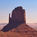
the picture is pretty but the orange and the purple on the top bar is really bad
its ok it just the orange and purple bar
I was expecting pink, tell me why the background looks so yellow and purple at the top? 1 star out of 5, this thing is full of lies.
TRASH!!!!!!!!!!!!!!!!!!!!!!!!!!!!!!!!!!!!!!!!!!!!!!!!!!!!!!!!!!!!!!!!!!!!!!!!!!!!!!!!!!!!!!!!!!!!!!!!!!!!!!!!!!!!!!!!!!!!!!!!!!!!!!!!!!!!!!!!!!!!!!!!!!!!!!!!!!!!!!!!!!!!!!!!!!!!!!!!!!!!!!!!!!
The bar on the bottom right suggest the original watermark was covered.
The orange and purple combination is horrible to look at. I'm sorry.
It would be alot better if the top bar was pink just like the background and them new tab was purple or something
the yellow and purple were too much
like why did I think it was gonna be like a pink or lavender color on the top but nooooooo! orange and purple not the best choice 2 stars cause i like the overall backround.2 outta 5 i do not like
dislike
the bar above is very important since its constantly in view, the image of the mountains is pretty yet the color combination is horrid. Orange and purple are just the duo that dont fit with me so ... thanks but no thanks
Bright solid orange and dark solid purple look terrible together and picture doesn't fit screen. Nice thumbnail though.
the picture is very pretty so if the bar and tabs were a peach color or something, it would be perfect but the bar is perfect and does not match and really throws it off. bad touch.
nhe
I don't like the orange .-. But otherwise its very nice <3
tabs are way too orange for my taste ... Rest was nice and as pictured w/ a beautiful lilac bar
The tabs are a bit too bright for me, and I don't understand where the purple came from. The picture's pretty; I'll give you that.
watermark is horrendous
I was not really feeling my tabs at the top being orange and my top bar itself being purple. It is beautiful nonetheless.
beautiful picture but hate the top how its purple and orange
Bright orange tabs with purple for rest of top bar
Details
| Version | 1.1 |
| Updated | Sep 10, 2011 |
| Size | 442KiB |
| First Seen | Mar 21, 2026 |
More by greenido


Popular Extensions